Picture this.
You’ve spent a ton of time designing your website.
You’ve picked an attractive theme, added stunning images, and crafted compelling copy.
You’re sure visitors will love it (and you).
The only problem?
You aren’t getting any visitors.
In fact, your site is nowhere to be seen on Page 1 (or even #2 or #3) of Google.
What’s going on?
Well, here’s the thing.
Your web design might be the reason your site is ranking so low in search engines.
Ready to turn things around?
What follows are 10 of the most common web design mistakes that may be hurting your SEO efforts and your rankings – and how to avoid them.
1. Poor Website Navigation
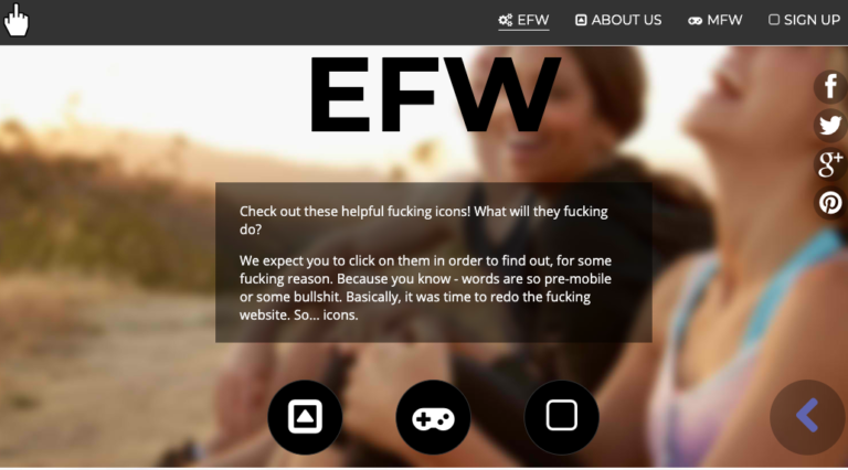
Ever visit a website and have no clue what to do next?
You know, something like this.
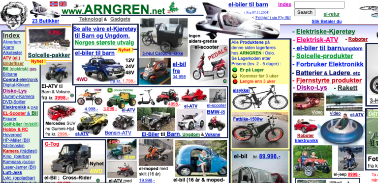
I bet it had you running for the hills in panic.
You don’t want your own visitors to do the same.
Right?
Instead, you want them to know exactly what to do at a glance.
Plus, you want Google’s web crawlers to understand your site.
To achieve this, make sure to prioritize internal linking between your important pages.
2. Slow Page Load Speed
People in the online world move at lightning speed.
They’re constantly zipping through social media, hammering away at emails, and zooming past a ton of generic headlines on the SERPs.
This means if they take the time to click on your site, and it takes forever to load, they’ll be gone before you know it.
After all, you didn’t invent the Keto diet or men’s wool socks.
There are other websites with the same information you have.
If you want your visitors to stay?
Make sure your pages load in three seconds or less.
The scary part is the beautiful WordPress theme you carefully selected might be the reason your site takes an eternity to load.
To fix this?
Ditch your sluggish theme for one of these tried-and-tested favorites:
- Hello Elementor – This theme is simple and minimalistic, allowing for a clean interface and incredible speed.
- Astra – Astra’s theme is one of the fastest loading themes on WordPress. It’s also super easy to use, with attractive pre-built demos for popular industries like pet care, outdoor activities, and more.
- OceanWP – This theme allows you to have a beautiful design without compromising speed. It’s a fully responsive theme that looks great, even on smaller devices.
3. A Non-Mobile-Friendly Site
Ever meet someone who told you he didn’t own a smartphone?
If you have, I bet you had a ton of questions for this person.
Because the truth is, we expect everyone to own a mobile device.
In fact, there 275 million smartphone users in the U.S. (For comparison, there are 331 million people living in the U.S.)
Do these people use their smartphones to consume digital media?
You bet!
In fact, 70% of all digital media consumed in the U.S. is done from a smartphone!
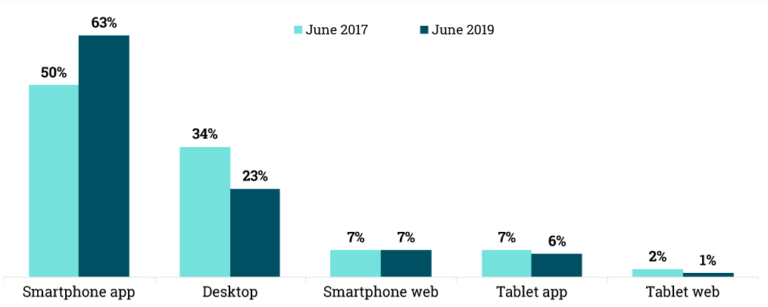
Worldwide, 52% of web traffic comes from a mobile device.
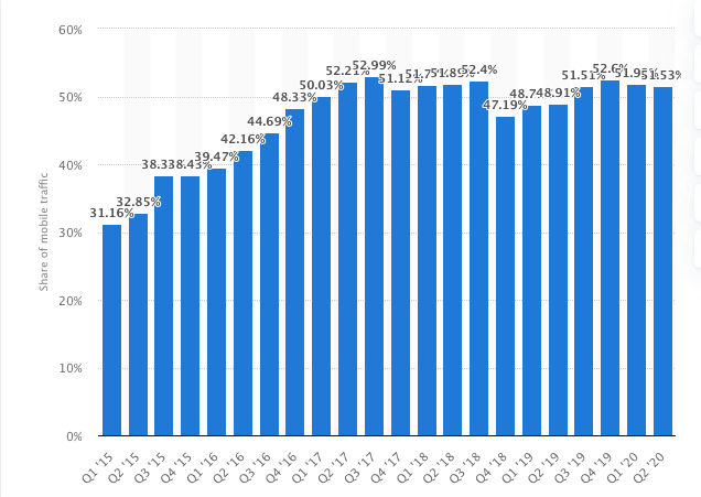
Of course, Google took notice and came up with mobile-first indexing.
Don’t let Click Fraud take advantage of you
Start a free trial with Clickcease and experience GoogleAds marketing in a fraud-free environment.
This means it prioritizes the mobile version of a website for indexing and ranking.
If your site isn’t optimized for mobile, expect it to essentially be invisible in the SERPs.
What’s more, visitors are 5x more likely to leave a non-mobile-friendly site.
But don’t worry.
It only takes a few tweaks to make your site mobile-friendly.
4. Missing H1 Tags (Especially on the Home Page)
Your H1 tag is the first thing search engine crawlers look for to help them determine what your site is about.
If you don’t have one?
Your site will more than likely fall in the SERPs.
But including an H1 tag is more than just pleasing Google.
It’s pleasing your visitors as well.
For instance, take a look at STUDIOPRESS’s homepage.
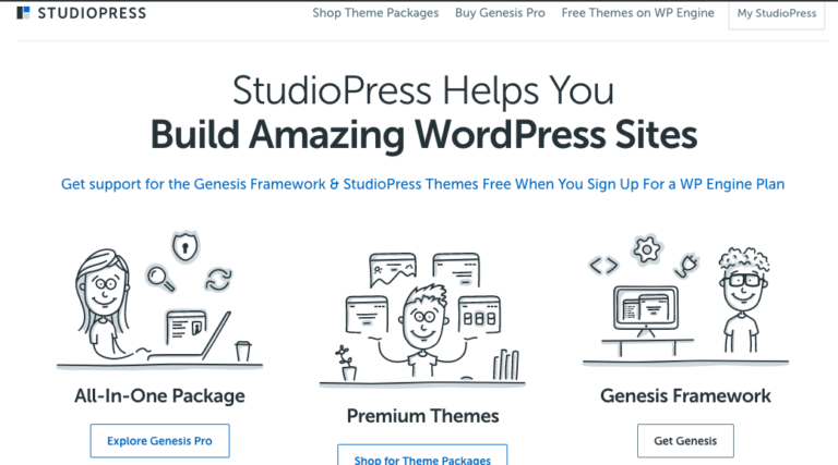
At a glance, you know exactly what the site is all about.
Here are three tips on using H1 tags to please both Google and your visitors:
- Include your primary keyword in your H1.
- Put your H1 above the fold – the visible space people see before scrolling down.
- Apply the 5-second test. If visitors can tell exactly what your site is about in 5 seconds, your H1 tag is great.
5. Large Images & Media Files
Tempted to pack your website with beautiful images?
I hear you.
We’d all love our sites to look like this.
Or this.
And that’s great.
But did you know that large images and media files can slow your site down?
To make sure this isn’t happening, run your site through Google’s PageSpeed Insights Test.
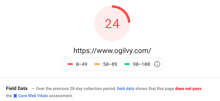
Scroll below to find out what Google suggests about the images you’ve used.
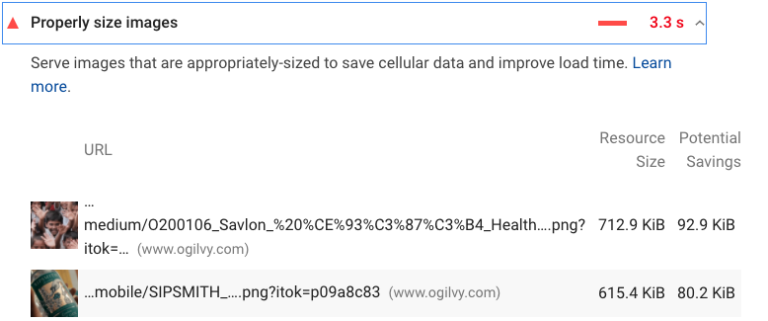
If they’re too large, you can either resize them or compress and re-upload them to your site.
6. Disruptive Pop-Ups
Do you use pop-ups?
Don’t worry.
When used correctly, pop-ups can convert up to 1,375% more email subscribers
The problem emerges when your pop-ups interrupt and annoy your visitors.
According to Google, sites with annoying pop-ups will have trouble ranking high on the SERPs.
The solution?
Build popups your audience will love.
OK. They may never love them, so you should at least build high-converting pop-ups that won’t annoy them.
For instance, you can time a pop-up to appear once a visitor has spent at least 30 seconds on your site.
Or once a user has scrolled halfway down your page.
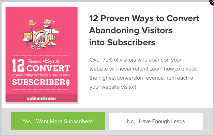
Another thing you can do is create mouthwatering pop-ups.
Like this.
7. Text in Images
This problem isn’t hard to avoid, so it’s a surprise that so many web designers do it.
Here’s what it looks like: adding text directly into an image instead of over the image.
Like this.

The problem is when you add text directly into an image, you’re missing out on the chance of using an H1, sub-headline, and relevant keywords above the fold.
Remember, although your visitors can read the text in images, Google can’t.
8. Infinite Scroll
Ever had to scroll to the bottom of a webpage and see new content loading?
That’s infinite scroll.
And while it’s OK, it poses one problem.
Google bots can’t scroll.
This means they won’t be able to index the additional pages on your site.
For example, your site has 100 pages.
However, your default setting only shows your 10 most recent posts.
When Google crawls your site, they won’t know there’s any content beyond these top 10 posts.
9. Thin Content
In the online world, your website is your storefront.
This means you should decorate it so visitors are attracted to it and know exactly what you offer.
Also, you want to optimize it for keywords so people can find you.
To make sure you hit both birds with one stone?
Avoid thin content.
Here are three signs of thin content.
Not Having Service/Product Pages
Eliminating these pages means letting go of the chance to rank for relevant keywords.
Listing Multiple Products or Services on One Page
It’s a great idea to have one keyword per page.
This means one product or service per page.
Make it easy for Google to understand what every one of your webpages is about.
You should be rewarded with greater visibility in the SERPs.
Thin Content on Your Product Pages
Don’t merely scratch the surface when working on your product pages.
Fill them with quality, keyword-targeted copy.
Also, make sure what you write is compelling enough to turn visitors into customers.
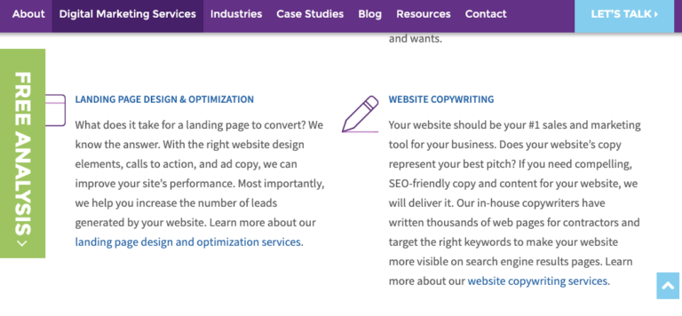
Resist the urge to write lazy copy.
Like this.

10. Not Having a 404 Page
A 404 page is a necessity.
It’s not that random page you create on a Saturday when you have nothing to do.
It’s an important page telling visitors you care about their experience.
You want to keep them on your page and show them where to go next.
With a little creativity, you can use your 404 page to make visitors smile instead of feeling annoyed.
