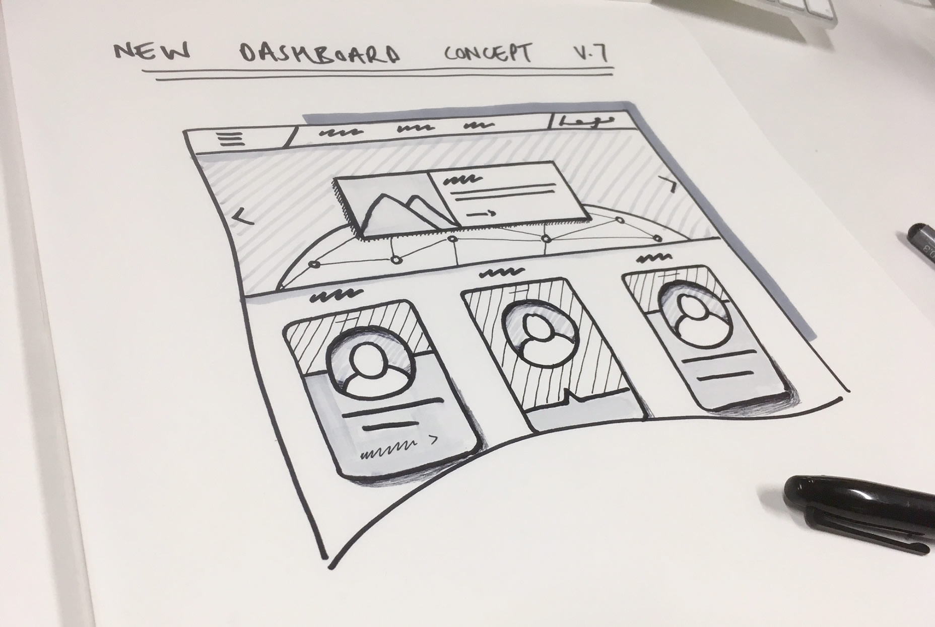
If experience has taught me anything it’s that pictures are better than words, nothing aligns everyone’s understanding of a web design problem like a quick scribble with a sharpie (other writing instruments are available). It’s the quickest, easiest and cheapest way of making others understand your design thinking… so why don’t we do it more often?… in fact why doesn’t everybody do it?
Why?!
Maybe we scare people off? one thing we often fall foul of as UX designers is making our sketches impressively artistic (which is great – it lends them an air of creativity and makes them easier to progress “look at these beautiful sketches” etc etc) but we need to realise that this really isn’t the point of sketching. We sketch to quickly and simply convey information.
Often our ‘artistic’ sketches can make others feel like sketching is an activity reserved for creatives – more like a piece of art than a simple piece of information.

This creates a fear in everyone else that their quick scribble on a post-it note or napkin isn’t good enough, that the snooty designers might point and laugh and at it (sadly not always an unreasonable fear).
But it’s one we need to dissuade as much as possible—there’s huge value in getting all the people involved in any web design project comfortable with sharing their thoughts and their feedback visually.
If you still need convincing, imagine this scenario – a classic email ping pong conversation that we’ve all experienced before:
Client: Hey, Can you move the block to the centre. Thanks
You: Hi, Yeah sure which block? Regards
Client: Hello, Just the one at the top please.
You: Hi, Ermm do you mean in the header?
Client: Not sure, is the header the top bit?
You: Yes the element at the top of the page with the hero banner and primary CTA
Client: Sorry you’ve lost me, it’s the button you click that I want moving
You: Ah right…which button? [crying noises]
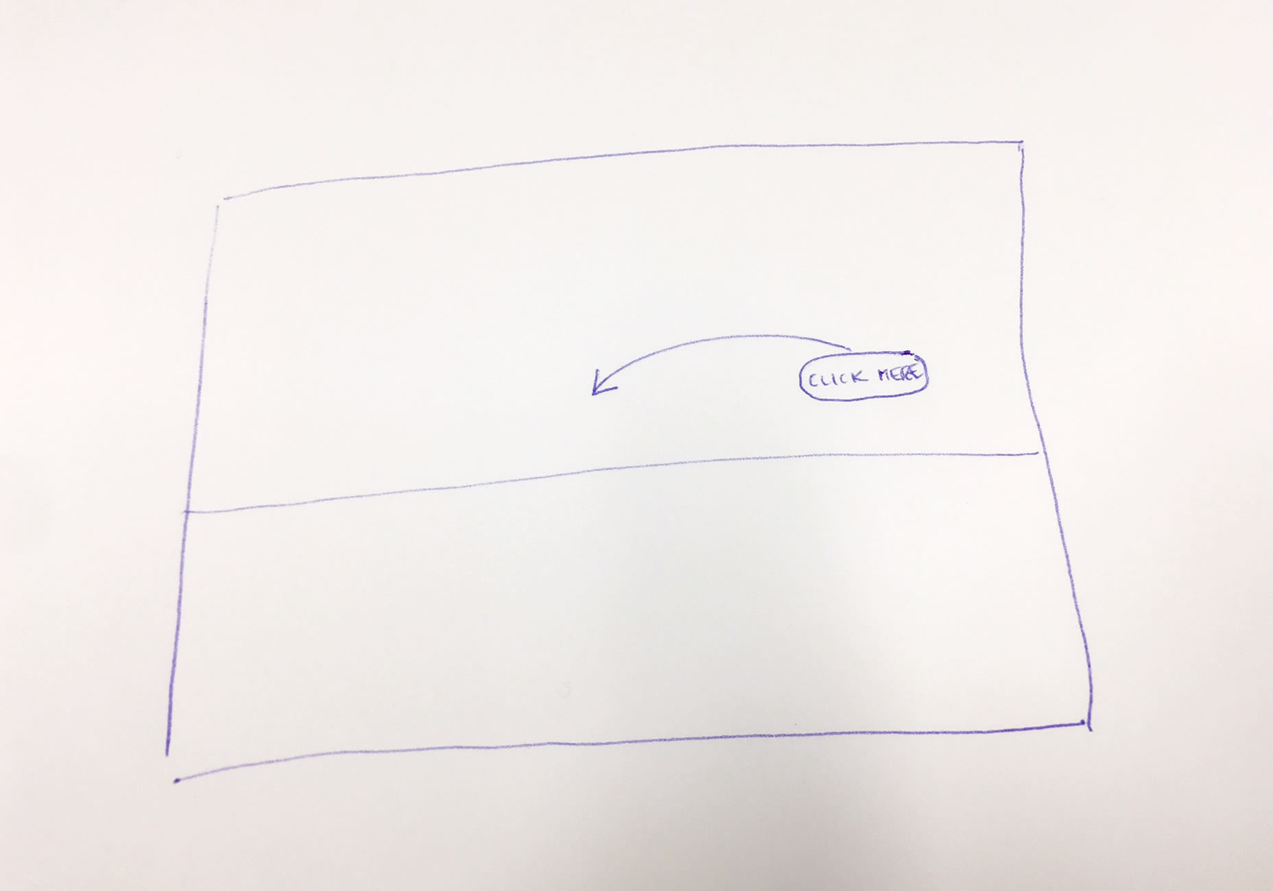
Instead of 18 wasted emails of 2 difficult phone conversations and a nervous breakdown, imagine this being the conversation
Client: Hey, Can you move the block to the centre – like this. Thanks

So how do we do this? how do you convince ‘Brian from Accounts’ that he can, and should, sketch out his ideas for the new finance software?
How
So if the main blocker for most people is a perceived lack of artistic skills “I couldn’t possibly draw something I’m not a designer” right off the bat you need to make sure everyone knows that the neatness or attractiveness of a sketch is irrelevant. People need to see a sketch as just a quick and easy way to communicate certain things, with the emphasis on quick. One of my favourite ways to frame it with people is to politely ask “would you be able to do me a real quick rough sketch of that? Nothing detailed, just scribble it out and send me a pic of it?”
Usually this is enough for good old Brian from accounts to pick up a pen and give it a try but there can be others issues.
Logistics
With the remote nature of some teams and clients it’s rarely as easy as walking round to someone’s desk with the actual paper a sketch is on. Faxing it is a little retro and mailing it might take a while! But thankfully technology easily comes to the rescue, just encourage people to scan their sketch or even take a picture on their phone if needs be.
Easy to use software that allows digital sketching such as inVision also exists. These tools allow amazing ways to collaboratively sketch, but while they are indispensable to many UX Designers it’s always worth considering how daunting this might feel to the audience we’re talking about before suggesting it.
Not My Job
As we’ve discussed the biggest barrier to getting everybody on board with sketching is usually a fear of being laughed at—‘how stupid and quaint it is that Brian from accounts thinks he can design now.’
This is even more true of your senior clients or stakeholders—this stems from the fact that there’s something quite vulnerable about presenting things that you’ve drawn yourself. A CEO of a massive mega global organisation may be very comfortable firing off written directions in email form but sketching some feedback to go along with it won’t come naturally to them at all; it’s not their job.
To get round this one it’s a case of setting expectations and positioning a sketch as nothing more than a scribble, something that won’t be viewed based on its artistic merits or shared unnecessarily. What I’ve found works well in the past is to demonstrate this. By this I mean actually creating a super rough and ugly sketch yourself early on in the project to prove a point. Show everyone that it’s ok to share that ‘napkin sketch’ without fear of it being publicly mocked.
When
So now you’ve (hopefully) got everyone onboard with sketching is there a right and a wrong time to entourage it?
In truth whenever you’re involving others in your project you should be pushing people to express themselves through a quick scribble—communicating ideas visually just works better nine times out of ten. There are however points in a project where you’ll find you can get the best out of sketching as a methodology, in my experience there are 2 key areas that benefit most.
IDEAS TIME
Early idea generation is a fantastic time to be encouraging the quick iteration of ideas that sketching allows – ideally with everyone in the same room clutching a sharpie. You’ll find that by getting everyone actively contributing to the creative process, regardless of their role, will remove a number of project hurdles very quickly – it also has the unexpected benefit of helping you get buy-in from everybody if they feel like they had an active hand in defining your design solution. If they drew a little bit of it themselves – they’re invested!
A nice simple way to get people sketching in this kind of situation is to lay the room out so that everybody has a pad and pens sat in front of them begging to be picked up and used.
FEEDBACK LOOPS
Any point at which feedback is being gathered is the other time where I’ve found you can get the most benefit from encouraging everybody to sketch. The biggest benefit you’ll likely see here is the wonderful time saving you can get from removing misunderstandings (and the inevitable frustration that comes with them).
Obviously receiving a tiny sketch of every single feedback point from every single stakeholder would quickly drive even the most seasoned UX Designers round the twist (basic feedback like “Change LTD to Plc in footer please” would rarely benefit from an accompanying sketch). Instead just try and make sure your stakeholders know that if they think that any of their feedback might be tricky to follow you’d love them forever if they attach a quick sketch or even print out the design/page/wireframe in question and scribble on top of it.
So next project, break out the felt tip pens and hand them around.
