Google’s John Mueller recently stated there’s no fixed time frame for search ranking changes after improvements have been made to a site. When it comes to improving page speed in particular, Mueller says that’s a small ranking factor. Google cares more about serving the most relevant content rather than serving the fastest pages. This information […]
This is a sponsored post written by SE Ranking. The opinions expressed in this article are the sponsor’s own. Backlinks are the backbone of your website – the stronger they are, the better the position of your website. However, even the slightest change in your backlink profile – like the link disappears or a malicious one being […]
Although Google supports emojis in search results, it may choose to filter them out in certain circumstances. The topic of emojis in search results came up during a recent Google Webmaster Central hangout with John Mueller. A site owner was concerned about emojis not showing up in search after being added to his site’s meta […]
Bing Ads has decided to remove data from the Share of Voice report, saying it’s no longer needed after introducing the competition tab. The competition tab, rolled out in September, offers richer visualizations and actionable recommendations using AI-powered features. As a result, Bing Ads is removing irrelevant columns from the Share of Voice report. “We hope this update […]
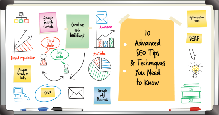
The beating heart of search engine optimization hasn’t changed much over the past year: you still need to: Focus on creating valuable content. Build high-quality links. Prioritize semantic search as you do your keyword research. However, some of the things that have changed – from the introduction of mobile-first indexing to the way Google now uses real user metrics to measure […]
There are many practices from the dawn of SEO that are still useful. These are old school tactics and habits that successful affiliates used to help their sites rank better, helped them earn more and kept them from getting banned. I’d like to share some of these practices because they are still useful. 1. Discretion […]
Google’s AI Blog published an article discussing how Dataset Search works and what signals it uses to rank datasets. Google is already showing dataset rich results and may begin showing more as publishers add the Schema.org markup. Understanding what datasets are and how to rank them is important because it can become a new source […]
I optimize WordPress without an SEO plugin. The reason is because SEO Plugins have more features than I need. I have been asked many times to share how to do SEO with WordPress without an SEO plugin. Here is how to do WordPress SEO without an SEO Plugin. This article is not intended to persuade […]
In a webmaster hangout, a publisher asked how fast Google removed pages from the index if they added a noindex nofollow to it. The publisher stated they had added noindex but the page remained in Google’s index. Google’s John Mueller responded with an answer that described how often some pages are indexed. John Mueller revealed […]
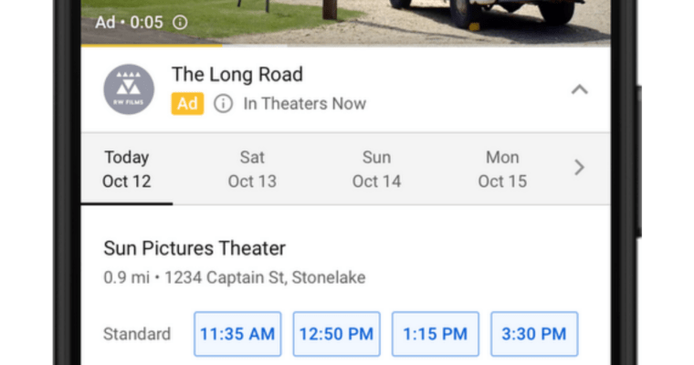
Google has introduced new capabilities for YouTube ads that will help advertisers drive more conversions. The new features combine the creative solutions offered by YouTube with the machine learning and measurement solutions offered by Google Ads. Ad Extensions YouTube advertisers will soon be able to drive more conversions with a wider variety of video ad extensions. In […]

